What makes a well-designed email? First, it is important to understand your audience. If you have an attractive email but have misunderstood your audience, you have failed. Sending to the right, targeted list the first time is important. Emails should be designed with their target audience in mind. Are most of your subscribers opening on a mobile device? Do your readers want to see numerous product images, or linked to your website instead? Well-designed emails are clear, concise, easy to read, and visually appealing.
Creating a successful, well-designed email is a journey. It can be simplified by using some best practices and basics of email design that we will cover below.
- Email header
- Email width and size
- Images
- Fonts
- Links
- Call to action
- Unsubscribe link
Email header
The email header is the first part of the email that recipients see and contains important elements, primarily the following:
- From Address and Display Name
- Subject
If a recipient does not know who the message came from, they will likely not open it. Recipients also look at the From Address to verify if the email is legitimate or not. Use a valid email address for your domain, and not a public domain, like gmail.com. Also, use a company email for your Reply-To Address.
Establishing trust with your recipients starts with your From Address.
Use clear, concise, and compelling subject lines. Subject lines are very important and your recipients’ first impression! Words matter – avoid spam triggers in your subject line. There is varying advice on what works best for subject line length or max number of words. Keep in mind where your readers are viewing emails (desktop or mobile). When viewing subject lines in mobile, such as Gmail on an iPhone – subjects cut off after 43 characters. Only you know your audience!
Along with the subject line, remember to include preheader text which is the text that appears next to your subject line in the email inbox. Preheader text comes from the first line of text in your email or created in coding. This is another chance to inform your recipient about the contents of the message and entice them to open it. In this example below, Fanatics.com uses the preheader text to alert you that the coupon expires that day.

Email width and size
Create your emails with the most common and recommended email width of 600px, and 320px for mobile phones.
Why? Emails larger than 600px can be cut off in screens for inbox clients like Outlook and Yahoo. When the message is cut off due to the size of the email and the screen on which it’s being viewed, the recipient has to scroll horizontally to see your message in its entirety.
If you are not an HTML expert, use HTML email templates to get great-looking emails. HTML templates are created and tested by expert designers to render well across various email clients. Save time! Use a library of master templates that have been tested to work well. Instead of focusing and spending time on design each time, you will be able to focus on the elements that matter (to drive opens and clicks!).
Images
Avoid using background images. Some email clients, like Outlook, disable background images. You don’t want to use enormous images that take up too much space on the screen. Images that are too large will also force your recipient to scroll to see the entire email.
Another no-no? The use of ONLY images in your message with ZERO text. For recipients that only accept text emails, or those that use screen readers for accessibility – using only images may prevent recipients who prefer text-only emails from seeing your message. They will receive a blank message. Image-only emails are
often used by spammers and trigger spam filters.
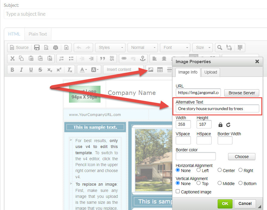
Use descriptive alternative text in case your images break. Alternative image text also helps make your email more accessible for recipients that use screen readers.

Another option is to use animated gifs, which work in most email clients and versions.
Fonts
Stick to using no more than two fonts in a message. Recommended font sizes are 12-14px for the body of your message and no larger than 22-28px for headings. Fonts should be email and web-safe. If you use a font that is not available in the recipient’s email client or web browser, it will be substituted – which can cause
your design to be inconsistent.
A list of standard email-safe fonts that are included by default on every device:
- Arial
- Courier New
- Georgia
- Tahoma
- Trebuchet
- Times New Roman
- Verdana
Web-safe fonts are those that are found on most devices. For web-safe fonts, read a list from W3schools.com.
Links
Your links should work and take your recipient to the correct destination. They should be easy to identify and clearly labeled so that the recipient knows what they will get when clicked.
ALWAYS test before you send your message out to the world. This includes the unsubscribe link! There’s hardly anything worse than hitting send on a message only to hear that a link you sent was broken, or the wrong link.
Avoid using anchor links. Anchor links are disabled for mobile devices like Apple, and there isn’t broad support amongst other email clients.
Call to action
Always include a call to action (CTA). Limit the number of CTAs in your message, and make them clear for your reader to understand and follow. Call to actions should be above the fold – meaning readers can view without needing to scroll down.
Speaking of CTAs, in email design it’s important to think about layout. Even when recipients are compelled to take the first step and open your email, they are not likely to spend much time reading your message. As they skim your email, your design should draw their eyes to the most important information you want them to know.
This can be done with the use of strategically placed large headlines and images to draw their eyes.
Unsubscribe link
Last but certainly not least, we are going over some best practices for your unsubscribe link. The main takeaway about unsubscribe links? Don’t forget it, don’t hide it, don’t use tiny font, and don’t make it a light color or similar to the background of your email.
Recipients who don’t want your emails will find a way to unsubscribe anyways!
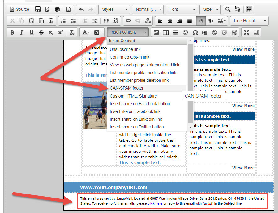
JangoMail automatically includes a CAN-SPAM compliant footer that is added to the end of your email if you forget to include your unsubscribe link. You can easily insert it yourself in the JangoMail message editor: